U-Haul
Design Research, UX, and UI Design
Throughout my tenure with U-Haul, the website underwent a massive overhaul to bring it to a quality standard above and beyond the competition. I enjoyed taking a dated platform and completely renovating its processes, layout, aesthetic, and user experience. My role in the design team was to add a fresh perspective and a modern aesthetic while acting as a specialist in design research. I will be showing you three projects from research to completion that I've been involved with at U-Haul as an example of the larger body of work I've completed


CORPORATE SALES
DESIGN RESEARCH
The corporate sales project is a complete overhaul of the existing pages and site design from the site map to the photography. I was personally in charge of conducting all of the design research to gather inspiration for the redesign. The project included several phases of research including benchmarking features, interviews, user flows and maps, content taxonomies, site mapping, and card sorting. I then worked with the business unit and acted as their copywriter for the project. This content was evaluated with our digital marketing and analytics team. The research results and copy are reflected in the current wireframes and mockups.
Interview evaluations
and best practice benchmarking


IA content taxonomies
of 5 benchmarked competitors
Site map, card sorting, & user flows


New content taxonomy generated from research
PRE-EXISTING DESIGN
Overall, the preexisting design is aesthetically dated, functionally inept, and the mobile adaptation was generated as an after-thought. Functionally, the navigation had issues, the sign-in was getting ignored, and customers were not appropriately directed to create a business account (essential to make purchases). The whole of corporate sales included one landing page and three subpages of content. The navigation did not include the landing page and customers often got confused while on the page and circulated back to the same page through the footer.


1 Landing page,
3 sub pages
Excessive copy on subpages left the customer feeling stagnant and uninterested. Pages were often content-heavy without providing much useful information to the customer, while the aesthetic made U-Haul appear less than the professional multi-billion dollar company that it is.


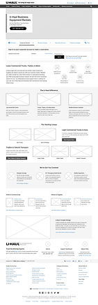
UX WIREFRAMES
This project was limited to Uhaul.com and therefore adhered to the design system style requirements and the current navigation of the existing site. To avoid confusion with the customer base, the proposed solution was to create a site ecosystem within U-Haul's main site with a sub-navigation and separate sign-in. The existing pages were redesigned and additional pages were added to Corporate Sales to provide more product and service details to prospective clients. Mobile, desktop, and tablet wireframes were constructed during this phase.


FINAL DESIGN
The final design aims to present a more professional appearance that coincides with the U-Haul brand. Although the content reflects what is similarly provided on the standard retail pages, the corporate sales pages have to condense this information and cater to a business audience. Below are two example mockups for the landing page as well as a link to the live site.


STORAGE REDESIGN
DESIGN PROCESS
The redesign of U-Haul's storage page took place in four stages: 1) benchmarking the competition, 2) initial redesign, 3) usability testing and 4) a follow-up redesign. The redesign affected two sets of pages including those pages launched from the storage landing page and the storage upsells included in the moving truck rental reservation process.


Extensive
30 page evaluation of competitor site features
2 Processes, 4 wireframes, & 4 mockups for 2 pages

PRE-EXISTING DESIGN
The existing mobile design for U-Haul's storage page had several opportunities for improvement as it was not originally designed with a mobile-first mindset. My goal was to reduce the excessive scrolling, improve the functionality of the filters and sort options, as well as make the overall experience more pleasing and as a result more likely to lead to conversions.


The existing desktop design also needed help with limiting the content to reduce scrolling. There was also no prices listed for the customer to compare locations. Furthermore, we found users ignored the filters and wanted to make this feature more user friendly and noticeable.

UX WIREFRAMES
The initial design went through 4 iterations and I worked with the business unit until they were more than happy with the page. I focused on our mobile adaptation first, making sure scrolling was reduced to only the most relevant information. Special attention was paid to the filtering system on mobile as this was a new standard to our design system. This mobile-first design was then adapted responsively to desktop.


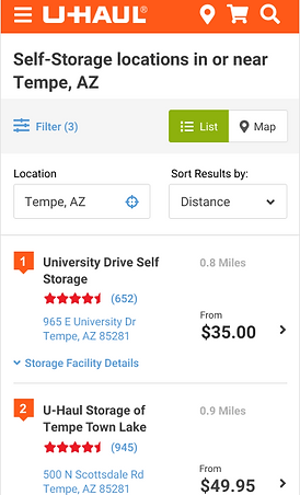
FINAL DESIGN
The final designs were mocked up utilizing our style guide and design system for U-Haul. The resulting design was evaluated with moderated usability testing. Modifications were made to the filtering system and the overall display and layout. The design is considered a success by our analytics team and by our tested participants.


The site has been live for over a year and continues to change via our usability tests and business unit modifications.


ROADSIDE ASSISTANCE
DESIGN PROCESS
The roadside assistance redesign was expedited as the previous page was having complications and company leadership felt very strongly that they wanted to aid their customers more effectively. As a result, the research phase was limited to benchmarking, stakeholder interviews, and customer surveys.

EXISTING DESIGN
The redesign of this page focussed on the mobile adaptation as a majority of the requests are placed on a mobile device. In addition to device concerns, customers filing roadside requests are often under stress and may be in compromising situations. The original design was one page and combined all options that the user would have to search and fill out in entirety. The amount of content was overwhelming and included all user scenarios.

.png)
.png)
UX WIREFRAMES
The process was broken down into the separate scenarios the customers face so that they wouldn't have to read through the information that was unnecessary for their particular predicament. This allows specific questions in the entry form that can provide technicians with more detailed information. This would reduced the need for a roadside assistant agent to call the customer for details. The correct gear and aid needed is dispatched as a result and reduces service times. Eleven different scenarios were identified and wireframes were created per scenario.

FINAL DESIGN
The final design aims to be more visual and to aid the customer through the roadside assistance request. It also encourages the user to include necessary images and information that was omitted in the previous design that the customer would otherwise have to add at a later time. This design has since reduced the overall call time length of the customer service calls in this department as well as the service response time for the customer.